Wrap text around an image
A picture beside the text, with the lines running past it and returning to the full measure below it, is the most common float of all. glu does it with the CSS of the browser: float: left or float: right, plus a width and some space. This recipe sets a short article with a figure and caption, an image at the start of a paragraph, and a box of facts that is only as wide as its longest line.
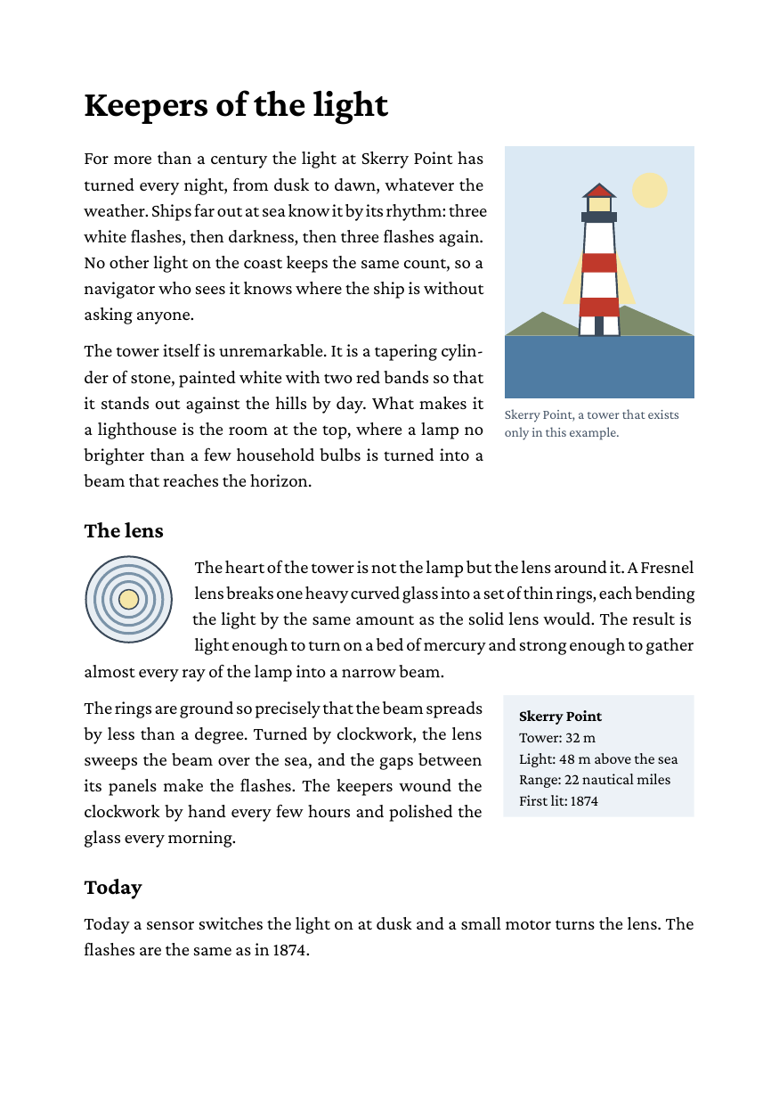
Full example: glu/html/image-runaround
Step 1: a figure with a caption
Picture and caption go into one block, written before the paragraphs that should flow beside it:
<div class="figure">
  <img src="lighthouse.svg" alt="A white lighthouse with two red bands">
  <p class="caption">Skerry Point, a tower that exists only in this example.</p>
</div>
<p>For more than a century the light at Skerry Point ...</p>.figure { float: right; width: 36mm; margin-bottom: 2mm; }
.figure img { display: block; width: 100%; }
.caption { font-size: 7.5pt; text-align: left; margin: 1.5mm 0 0 0; }The float takes its width from the CSS, and the image fills it. The paragraphs after it are shortened by the float’s width plus the space beside it for as many lines as the float is tall, then return to the full measure. A float taller than the text beside it makes its container grow, so the next block starts below it.
A float that holds a block image needs a width. Without one, a float shrinks to its content (see step 3), but an image has no line to measure, so the float takes the full width and the text goes below it.
Step 2: an image at the start of a paragraph
An image floated as the first thing in a paragraph floats at the paragraph’s first line, which is where CSS puts it:
<p><img class="left" src="lens.svg" alt="A round lens">The heart of
the tower is not the lamp but the lens around it. ...</p>img.left { float: left; width: 17mm; }This works for raster images (PNG, JPEG, a PDF page) and SVG alike. Only an image at the very start floats. One further into the paragraph, in a link, in a list item, or in a paragraph with a border or padding of its own stays in the line as an inline image; move it to the start, or write it as a block before the paragraph.
Step 3: a box as wide as its content
A float without a width is as wide as its longest line, at most as wide as its container:
<div class="facts">
  <b>Skerry Point</b><br>
  Tower: 32 m<br>
  Light: 48 m above the sea<br>
  ...
</div>.facts {
float: right;
background-color: #eef3f7;
padding: 2mm 3mm;
font-size: 8.5pt;
}That suits a box of short lines like this one. A float of running text without a width fills the measure and leaves no room beside it; the text then goes on below it, as after a clear. Give such a float a width.
The space between float and text
The float’s margin on the side of the text is the space between them, so a margin on the figure is all it takes. Where that margin is not positive, glu leaves -bag-float-gutter there instead, 9pt by default. The example sets it once for the document:
body { -bag-float-gutter: 4mm; }A browser leaves no space at all, and margin: 0 cannot be told apart from no margin. A stylesheet that should look the same in a browser sets the gutter to 0 and gives each float its margin.
The margins on the other sides work as in CSS: margin-bottom keeps the following lines clear below the float, margin-top moves the float down.
Ending the runaround
clear: both on a block starts it below every float. The example clears at each heading, so a new section never starts beside the previous section’s picture:
h2 { clear: both; }clear: left and clear: right only skip a float on that side.
Floats on the page
A float is painted after the blocks beside it, so a paragraph with a background color does not hide it. At a page break a float stays with its text: if the float and the first lines beside it do not fit at the foot of the page, both move to the next page. A float does not reach across a page break; lines beside it that land on the next page are set at the full measure there. A float taller than a whole page cannot be kept on one: it runs past the foot of the page it starts on, as any block of that height does.
For books with a wide outer margin, float: inside and float: outside pick the side from the page: the how-to Put notes in the outer margin shows both.
Limits
- One float at a time beside a block. A second float that starts while the first is still open goes below it, not next to it, even on the other side.
- A block beside a float is narrowed as a whole. Its border and background run beside the float, not under it as in a browser.
- A float shrinks to its content only when the content is lines of text. A table, a block image or a rule inside it keeps the container width.