Letterforms
What happens automatically
Text is shaped with a full OpenType shaping engine before any line breaking happens: standard ligatures form (fi, fl, ffi), kerning pairs apply, and marks attach where the font puts them. There is nothing to switch on; the sections below are about deviating from those defaults.
OpenType features
font-feature-settings toggles the optional features a font carries,
by four-letter tag:
.figures  { font-feature-settings: "onum" 1; }         /* oldstyle figures */
.plain    { font-feature-settings: "liga" 0; }         /* no ligatures */
.combined { font-feature-settings: "onum" 1, "liga" 0; }
Which tags do something depends entirely on the font: the built-in
Crimson Pro carries oldstyle figures (onum) and ligatures (liga),
but no small caps, so "smcp" changes nothing there (see
Small caps for the way that works with any font).
Consult the feature list of your font; typical candidates are smcp
(small caps), onum/lnum (oldstyle/lining figures), tnum/pnum
(tabular/proportional figures, the difference that makes numbers in
tables line up), and the discretionary sets dlig and ss01 ff.
Features declared in @font-face via font-feature-settings apply
to every use of that face; the property on an element adds to them.
Small caps
font-variant-caps: small-caps asks for small caps independent of the
font. A face with an smcp feature gets its designed small caps; for
any other face, such as the built-in Crimson Pro, they are synthesized:
every letter that changes when uppercased becomes its capital at 70% of
the size, with the case rules of the language, so ß becomes SS.
.name { font-variant-caps: small-caps; }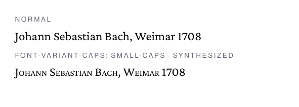
font-synthesis-small-caps: none switches the synthesis off, and the
font shorthand and font-variant accept small-caps too.
Synthesized small caps are capitals in the PDF, so search and copy see
BACH rather than Bach; designed small caps keep the original text.
Letter spacing
letter-spacing adds tracking between glyphs. Its classic use is
spaced capitals or small caps in headings; running lowercase text is
better left untracked:
h1 { letter-spacing: 0.12em; }
The spacing is added after every character, and a word space is one
(CSS Text 3 §7.2): the gaps between words grow by the same amount as
those between letters, so a tracked line keeps its words apart. A
space preserved under pre or pre-wrap grows as well.
Horizontal scale
-bag-horizontal-scale draws the glyphs narrower or wider by a fixed
factor; 90% and 0.9 are the same, the default is 100%. It is PDF
horizontal scaling: the advances, kerns and word spaces shrink with
the glyphs, so the line breaker works with the width the text really
takes.
th { -bag-horizontal-scale: 95%; }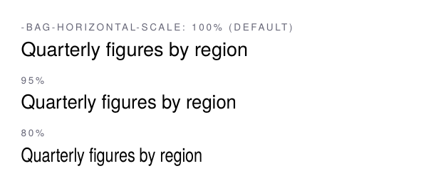
The property is inherited, and the factor does not compound: 90%
inside 90% stays 90%, and 100% returns an element to the normal
width. letter-spacing is not scaled, it stays the length it says,
and font expansion in justified text applies on top of the scale.
Scaling is a geometric distortion, not a narrow design. Squeezed
horizontally, a letter’s vertical strokes get thinner while the
horizontal ones keep their weight, and round letters turn oval; at
80% in the screenshot the o and the g show it. A condensed cut,
where the designer has redrawn the letters for the narrow width,
keeps the stroke contrast, so when the family has one, load it with
@font-face instead. The scale is for the places where a
few percent buy a fit: a table header, a label in a form, a heading
that should stay on one line. Around 95% the change goes unnoticed at
reading size; running text is better left alone, as the paragraph
breaker with hyphenation and font expansion fits it without
distorting a single letter.
Text decoration
text-decoration-line (underline, overline, line-through),
text-decoration-style (solid, double, dotted, dashed, wavy) and
text-decoration-color compose freely. Without an explicit color
the line follows the text color, as CSS’s currentColor initial
value specifies:

Italic correction
An italic glyph leans into the space of an upright neighbor: a closing parenthesis after an italic f collides visibly. OpenType has no metric for text italic correction, so glu offers a heuristic that inserts a small compensating kern at italic-to-upright boundaries:
body { -bag-italic-correction: auto; }
The property is inherited; none switches the heuristic off again
for a subtree.