Keep lines in register across columns
In two columns the eye moves sideways as well as down, and lines that almost stand level look like a mistake. This recipe puts every line of running text on a grid that belongs to the page, so the columns stay level whatever headings, tables and figures come between them. Printers call such lines in register. It takes one CSS property. The complete example is in the examples repository.
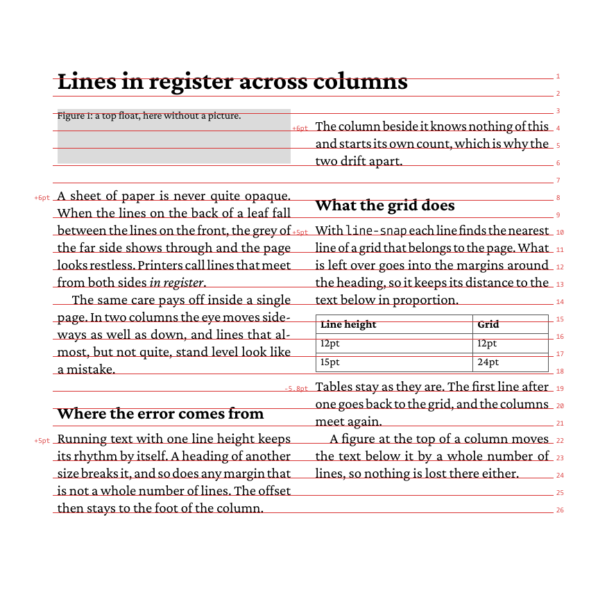
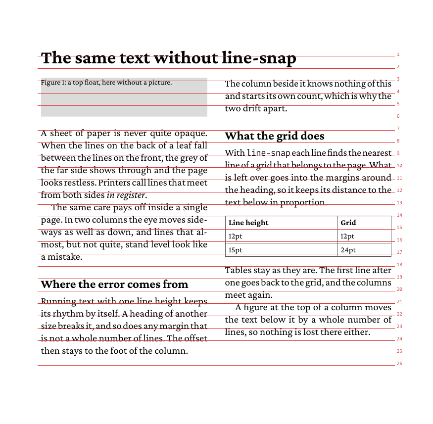
The red lines and numbers are the trace, explained below. The second page of the example repeats the same text without the property. Each margin and heading of another size moves the text below it, and the error stays to the foot of the column:
Turn it on
line-snap is inherited, so set it on the body. Headings usually stay free, so that their size does not force them onto a line:
body {
  font-size: 10pt;
  line-height: 12pt;
  column-count: 2;
  line-snap: baseline;
}
h1, h2 {
  line-snap: none;
}
The grid starts at the top of the page area. Its distance is the line-height of the running text, the one that carries the most characters. An @page rule can set it, also per page type:
@page {
  -bag-line-grid: 12pt;
}
The property works in a single column as well. With the same page size and margins on both sides of a leaf, the lines of the front meet the lines of the back.
From Markdown
The CSS is the same, in the file the frontmatter names:
---
css: paper.css
---
See what happens
The trace draws the grid, numbered at the right edge. A number means the same height in every column:
glu --trace linegrid document.htmlThe example turns it on in the CSS with -bag-trace: linegrid on the body. Remove that for the final document.
The small numbers to the left of some lines are the rests: how far a line had to move to reach the grid. +5pt means it moved down, -3pt up. Lines without a number stood on the grid already. See Debugging for the other traces.
Where the rest goes
Between two snapped lines there has to be a whole number of grid lines. What is left over goes into the margins between them, in proportion to them. A heading with margin: 6pt 0 2pt and a rest of +4pt ends up with 9pt above it and 3pt below it, so it keeps its relation to the text it belongs to.
A line goes to the nearest grid line, and the margins may shrink down to zero to get there. That has one consequence to plan for: a margin of less than half a line disappears. With a 12pt grid, margin-bottom: 5pt between paragraphs comes out as nothing, and 7pt as a whole empty line. Where a distance has to stay what it is, use a whole number of lines, or mark paragraphs with an indent as the example does:
p { margin: 0; }
p + p { text-indent: 1em; }
Between two lines without any margin, the rest stands as extra space above the line.
Text of another size
The lines of a paragraph move apart to the next multiple of the grid. Text with a line-height that is no multiple gets much wider: 15pt on a 12pt grid becomes 24pt. For a lead paragraph or small print, there are three ways out:
- Give it a
line-heightthat is a multiple of the grid, such as 24pt for a large lead. - Set
line-snap: noneon it, as the caption of the figure in the example does. The line after it finds the grid again. - Make the grid finer, with
-bag-line-grid: 6ptfor 12pt and 18pt text. Lines may then stand half a line apart across the columns, which is the price of it.
Tables, boxes and floats
- A table and a block image are not snapped. The first line after them goes back to the grid.
- A box with a border or background keeps its inside as it is. Its first line is snapped, the lines after it are not. A box that holds several blocks is not snapped again where it goes on in the next column.
- The space a top float takes is rounded up to a whole number of lines, so a float moves the text below it from line to line. It leaves up to one line more space below the float.
- Footnotes and bottom floats do not touch the text above them.
- A spanner such as the title above the columns does not break the grid: the lines below it stand on the same grid as everywhere else on the page.
Limits
- A block inside a plain container such as
<section>is not set again when it lands on a page of another width, for example from@page :firstto the following pages. Keep the page width the same in a document withline-snap, or do not nest the text. line-snap: containfrom the CSS draft is not supported.
For columns in general, see the multi-column example and Set a scientific paper.