Columns
A wide page set in one measure gives long lines that are hard to read. Columns split the page into measures of a comfortable length, as journals and newspapers do. glu sets columns with the properties of CSS Multi-column Layout; the CSS reference lists the exact values.
Setting the body in columns
column-count sets the number of columns, column-gap the space
between them:
body {
  column-count: 2;
  column-gap: 7mm;
}
Every page then holds two columns side by side. The text fills the
first column, then the second, and only after the last column moves on
to the next page. The width of a column follows from the content width
of the page: two columns with a 7 mm gap on an A4 page with 174 mm of
content are 83.5 mm wide each. column-gap: normal, the initial value,
is 1em of the element’s font. The shorthand columns: 2 sets the
count; a width in it is ignored.
Columns are laid out on body, and on a direct child of body that
has no border, background or padding. In the second case the siblings
of that child span the columns, which is the usual shape of an article
with a title block:
<header>…title, authors, abstract…</header>
<main style="column-count: 2">…sections…</main>
column-count on any other element is not laid out: the content is set
in one column, and glu logs a warning.
Breaks between columns
A column break behaves as a page break. Headings with break-after: avoid keep with the paragraph that follows them, paragraphs keep
widows and orphans lines together on either side of the break, a
table repeats its header rows in the next column, and a margin at the
top of a column after an automatic break is dropped (see Page
breaks).
break-before: column and break-after: column force a break to the
next column; on the last column of a page, that is the first column of
the next page. break-before: page skips the remaining columns. Outside
a multi-column layout a column break has no effect, so the same
stylesheet works for a document with one column.
Spanning the columns
column-span: all makes an element as wide as the page:
h1, .abstract { column-span: all; }The spanner stands below the tallest column before it, and the columns go on below it. Its margin below is kept. The columns above a spanner are always balanced, so the spanner does not leave a hole beside a short column.
A margin at the top of a column is kept below a spanner, as at the
start of the document, but dropped at the top of the second column,
where an automatic break leads. A first heading with a top margin
therefore starts lower than the text beside it. A rule such as
main > h2:first-child { margin-top: 0; } lines them up.
Balancing
On the last page, the columns are balanced: the text is spread so that
they end at about the same height, instead of filling the first column
and leaving the second one short. column-fill: auto switches that
off, and the last page fills its columns one after the other.
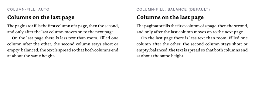
Balancing does not change the line breaks: all columns of a row have the same width. glu sets the row in trial runs at different heights and takes the smallest one that holds the text, with all the rules of a page break in force. A row whose text starts in its last column, after a forced column break, stays full.
Floats and footnotes
A float or footnote belongs to the column that holds it. float: left
and float: right stay in their column and the lines of the column run
around them. float: top and float: bottom go to the top or bottom
of the column, at its width, and so do footnotes: each column collects
the notes of its own text, below a rule as wide as the column. In a
balanced row they are placed at the foot of its columns.
Running heads, page numbers and the other page margin boxes belong to the page and are placed once per page, as in a document with one column.
Column rules
column-rule draws a line in the middle of the gap:
body { column-rule: 0.5pt solid #999; }It is drawn only between two columns that both hold text, as high as
the tallest column of the row. The color defaults to the color of the
element. As with borders, solid is the only style drawn.
Limits
column-widthis not read; the number of columns is fixed.- Columns do not nest, and an element with a border, background or padding cannot hold columns.
- Floats and footnotes inside a spanner are placed at the foot of the page, and the columns below do not make room for them.
- With
direction: rtlthe columns still fill from left to right.