Control table column widths
By default glu measures every cell and gives each column the room its content needs. That is a good default for data tables, but the column boundaries move as soon as the text changes: two signature blocks under each other end up misaligned, and a form looks different on every page. This recipe pins the columns down, for inline HTML tables and for Markdown pipe tables, which have nowhere to put a style attribute.
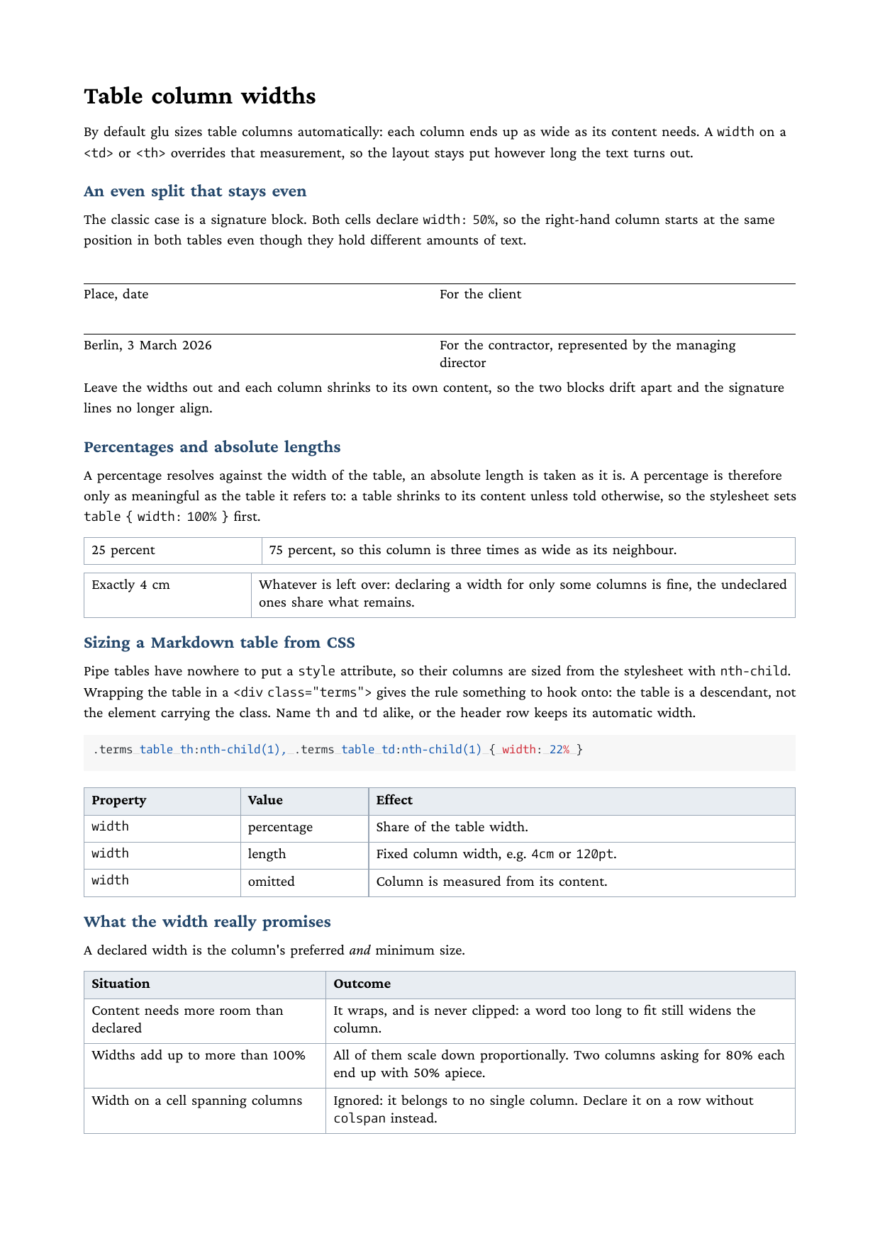
Full example: glu/markdown/table-column-widths
Step 1: give the table a width
A table shrinks to its content unless told otherwise, and a percentage on a cell resolves against the table, not the page. On a shrunk table, 50% is half of not very much. So the stylesheet widens the table first:
table { width: 100% }A fixed length (width: 12cm) works as well and sets the table to exactly that size.
Step 2: declare widths on the cells
A width on a <td> or <th> overrides the content measurement for that column. Percentages and absolute lengths both work, and declaring only some columns is fine, the undeclared ones share what remains:
<table>
  <tr>
    <td style="width:25%">25 percent</td>
    <td style="width:75%">three times as wide</td>
  </tr>
</table>

<table>
  <tr>
    <td style="width:4cm">Exactly 4 cm</td>
    <td>Whatever is left over</td>
  </tr>
</table>
The classic use case is a signature block: both cells declare width: 50%, so the right-hand column starts at the same position in every block, however much text each one holds.
Step 3: size a Markdown pipe table from CSS
Pipe tables generate a bare <table> with no place for a style attribute. Wrap the table in a <div> with a class and select the columns from the stylesheet with nth-child:
<div class="terms">

| Property | Value | Effect |
|----------|-------|--------|
| `width`  | percentage | Share of the table width. |

</div>.terms table th:nth-child(1), .terms table td:nth-child(1) { width: 22% }
.terms table th:nth-child(2), .terms table td:nth-child(2) { width: 18% }
.terms table th:nth-child(3), .terms table td:nth-child(3) { width: 60% }Two details matter. The class sits on the <div>, so the selector reaches the table as a descendant (.terms table, not table.terms). And every rule names th and td alike: selecting only td leaves the header row at its automatic width, and it stops lining up with the body.
Run it
glu table-column-widths.mdWhat the width really promises
A declared width is the column’s preferred and minimum size. Three edge cases follow from that:
- Content needs more room than declared. The text wraps inside the declared width and is never clipped; a single word too long to fit still widens the column.
- Widths add up to more than 100%. They scale down proportionally, so two columns asking for 80% each end up with 50% apiece.
- A cell that spans columns.
widthon a cell withcolspanis ignored, because it cannot be attributed to one column. Declare the widths on a row withoutcolspan.
Gotchas
- The blank lines around a pipe table inside a
<div>are required. Without them the Markdown parser treats the whole block as raw HTML and never builds a table from the pipe syntax. - For an HTML table,
<colgroup>is an alternative to per-cell widths:<col style="width:30%">(percentages, lengths, or the classicwidthattribute) declares the width once per column instead of on every row. A table with a<colgroup>always spans the full available width, so it needs notable { width: 100% }; columns without a declared width share what remains.
Related
- htmlbag CSS support for the supported property catalog
- The zugferd-invoice example for a full invoice table in the same technique
- Tables in the Lua API for programmatic tables with explicit column specs